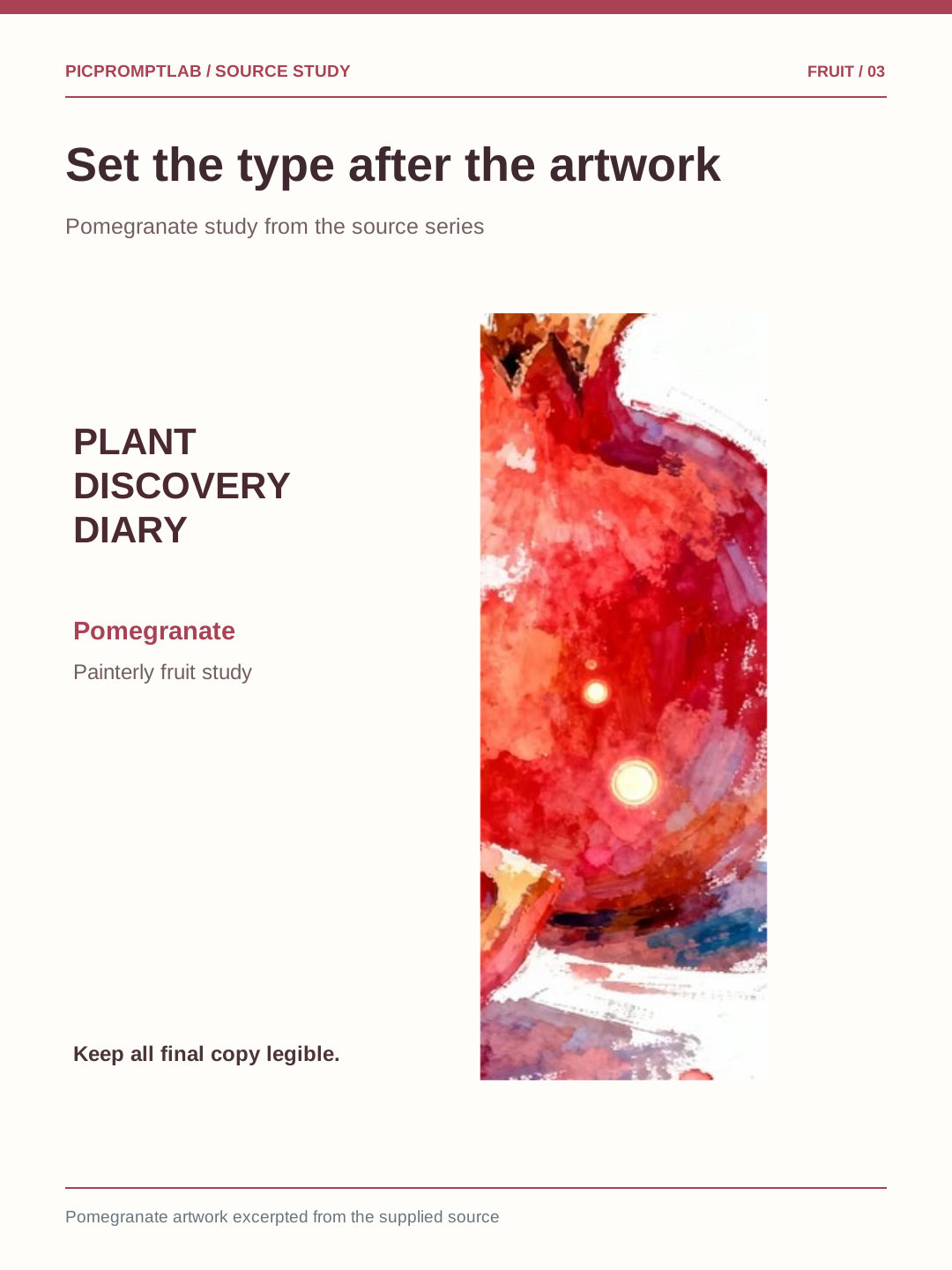
Build a painterly fruit poster series from one reference
Keep the painterly texture and editorial layout while treating fruit, color, and copy as replaceable parts.
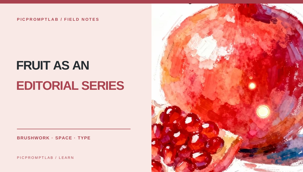
- Separate visual style from the fruit itself
- Generate artwork first, then set readable type
- Extend one layout into a coherent series
01 / 03
Extract the rules behind the reference
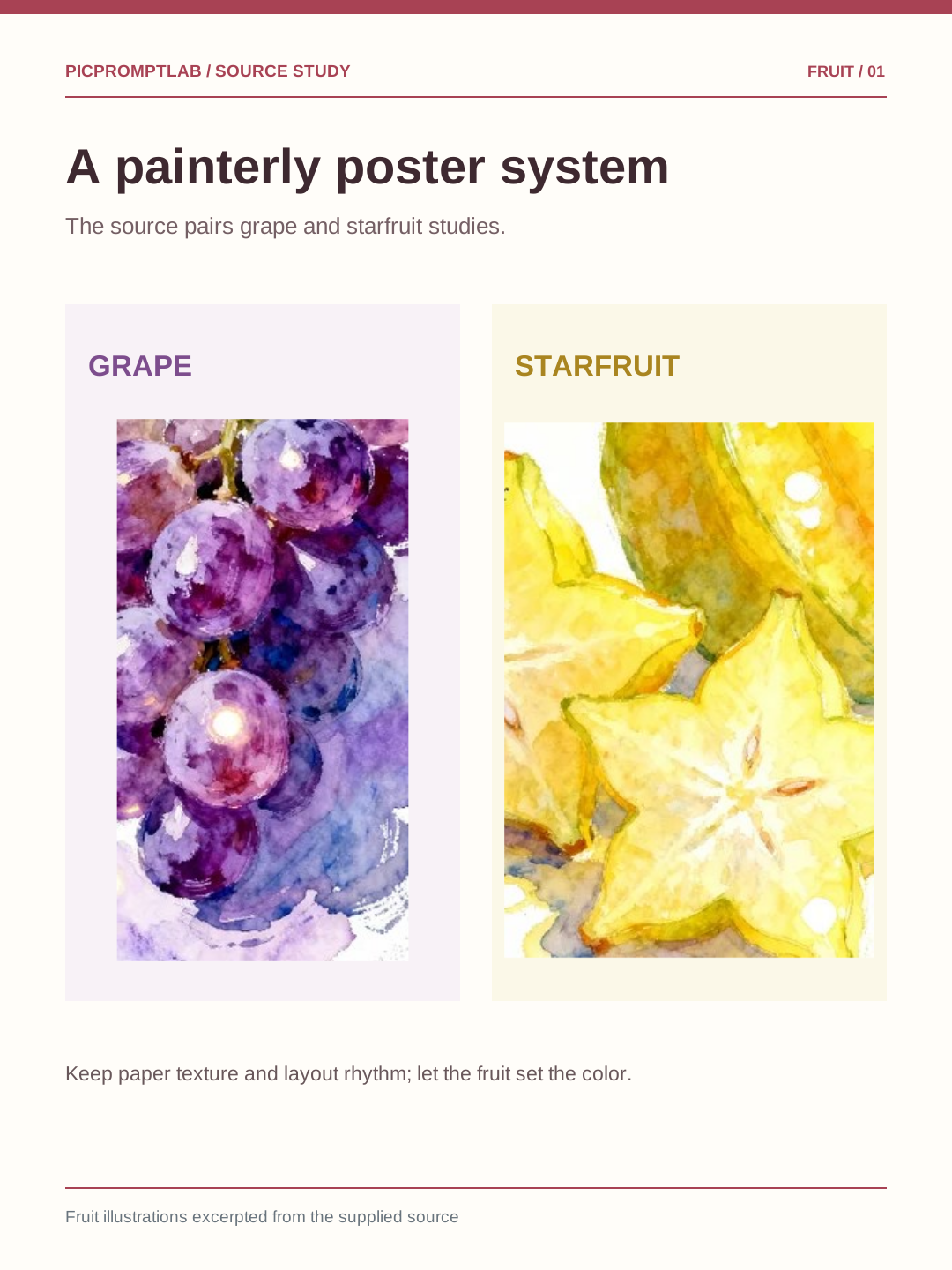
The source combines white paper, painterly texture, a vivid fruit subject, and restrained typography. The important details are not grape or lemon alone, but subject scale, brushwork, negative space, and type hierarchy. Record those constants first.
02 / 03
Keep the style; change the fruit
When switching to lemon, pomegranate, or blueberry, decide afresh how to show the cut surface, leaves, or juice. Let each fruit supply the dominant color rather than applying one filter to all posters. Ask the image model for artwork, and add final copy afterward.
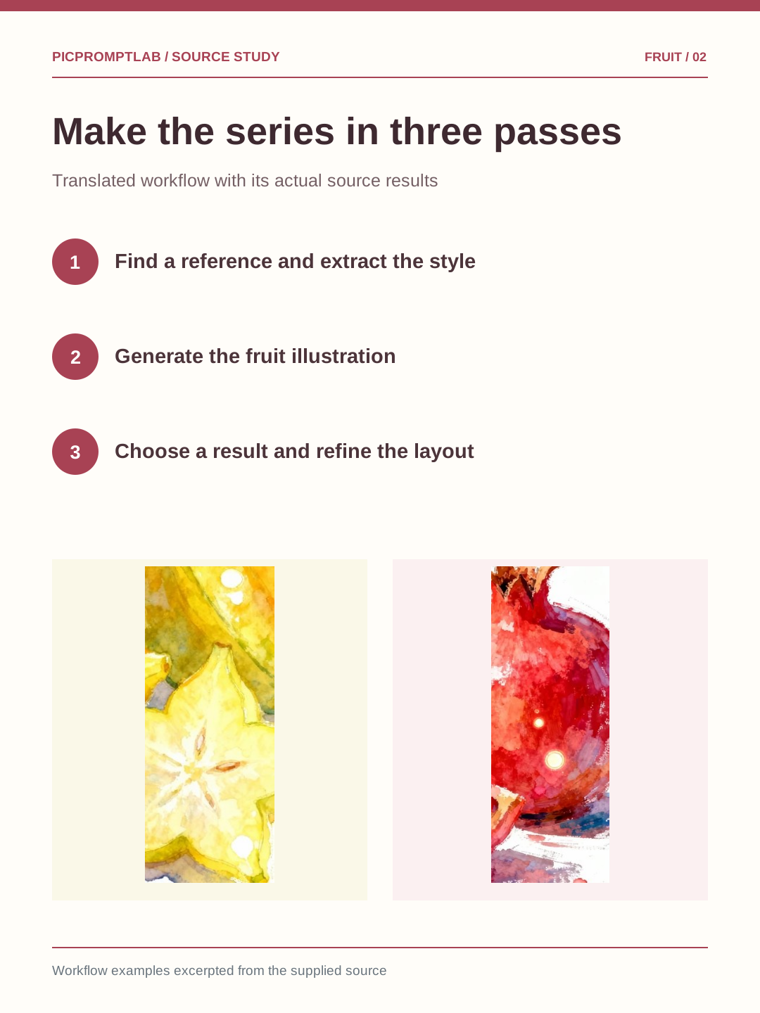
A cut pomegranate on warm white paper, with jewel-like seeds, natural leaves, and a restrained splash of juice. Delicate impressionist brushwork and subtle watercolor bleeding. Place the fruit in the lower middle of a vertical editorial poster, leaving generous clear space at the top for later typography. Soft natural light. No text.
03 / 03
Set the typography after image generation
Treat readability as the final pass. Keep the title clear of the fruit, give subtitles enough contrast, and write natural short lines in each language instead of literal word-for-word translations. Across the series, title scale and margins should follow one rule.